Creators across disciplines often argue that constraints give their work its creative force. Among the many forms constraint can take, technical limitation is perhaps the most familiar. Looking at graphic design from the pre–personal computer era, I'm often struck by this. The process was slower, more demanding, and far less democratised. Yet the results often feel more assured than much contemporary work produced under conditions of vastly greater technical freedom.
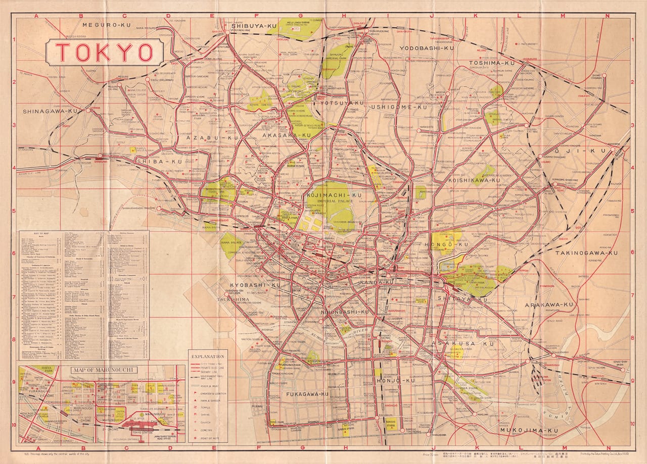
One such design caught my eye on the cover of a map while I browsed the shelves of Nagamori Shoten in Jinbōchō. Hand-laid type sat over a sakura-patterned wheel on a red background, graduating to blue, perhaps through paints, inks, or pigments. The combined effect of printing method, paper, and ageing is something designers might now spend hours attempting to reproduce with digital effects and filters, or approximate through specialist printers. The title read: Tourist Map of Tokyo.
Nagamori Shoten is a remarkable repository of historical maps, photographs, and transport timetables. Much of the material is kept in protective packaging, which discourages casual handling, so I bought the map for its cover alone—possibly the first time I have judged a map by its cover. I left the shop assuming it dated from the Shōwa era, likely the 1950s or 60s, and stored it away on my return to London.
When I finally opened it this week, the quality of the design stunned me: coral and beige layers printed with evenness; crisp red, white, and black lines marking streets and waterways; a judicious use of bright grass green for parks and open spaces; painstaking typography; and a restrained measure of ornamentation.
This is a members-only post
Join now to finish reading and access the full Tokyothèque archive.